Today’s sneak peek is a look at what has been going on in the study/home office in our new house. This room is much larger than the one in our previous home. A coffered ceiling, paneled walls, & a fireplace are a few of the architectural details I love about this space. However, it really needed a pick me up in the design area.
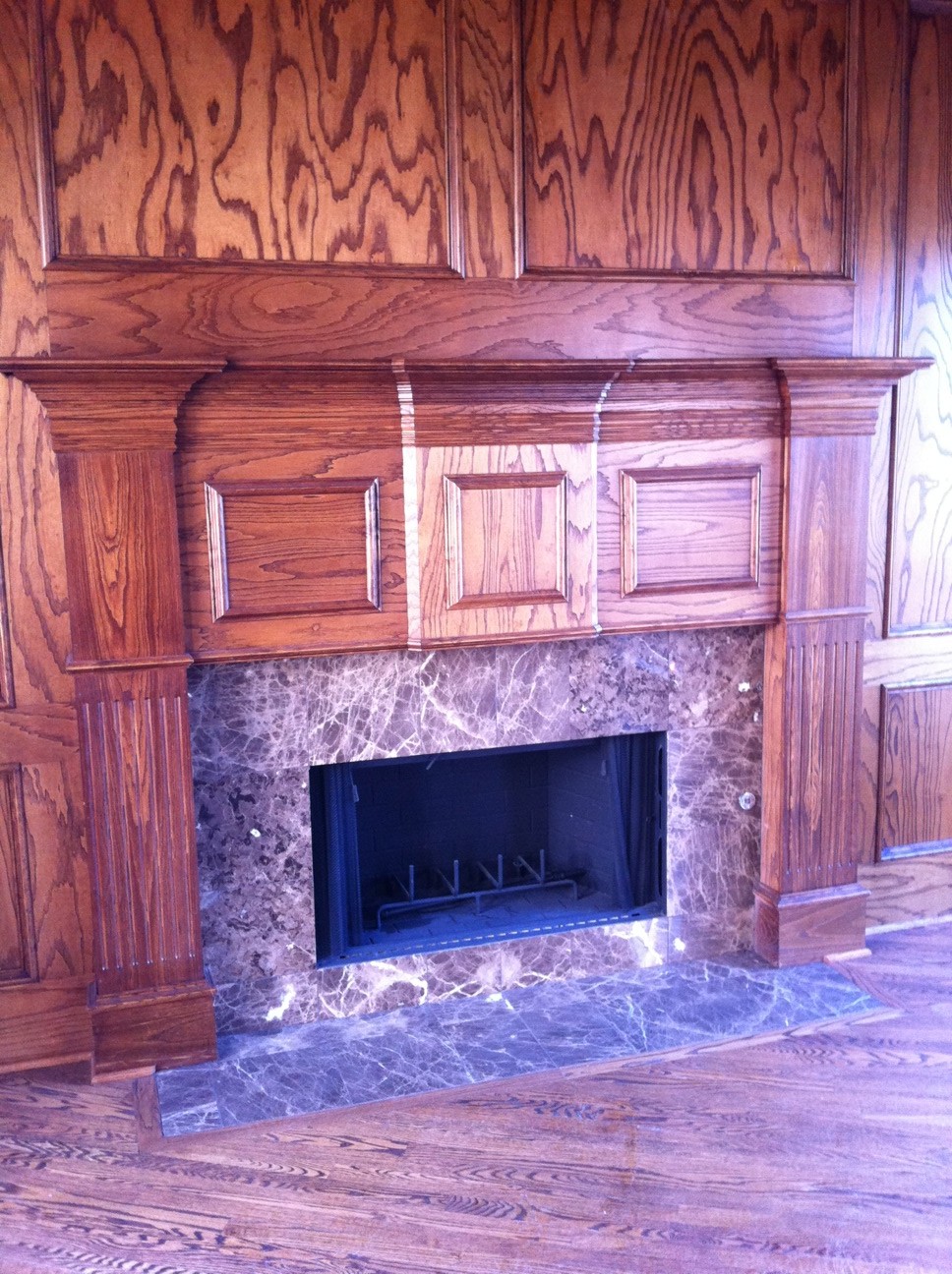
Here is the fireplace before. It’s nice, but not exactly what I would pick if I were building this house today. It needs a fresh feel. It seems sort of dated, right? The marble on the fireplace surround was really too taupe & brown for the vision I had in mind for this room. Notice the wood paneling. It’s red oak with lots & lots of grain showing through. I have a plan for that!
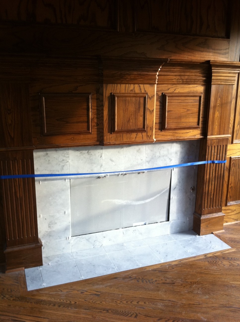
First things first. The fireplace surround gets rejuvenated with 12×12 Carerra marble tiles. There is also a credenza opposite the fireplace where I used a slab countertop of the Carrera marble. It’s already starting to take on a new look.
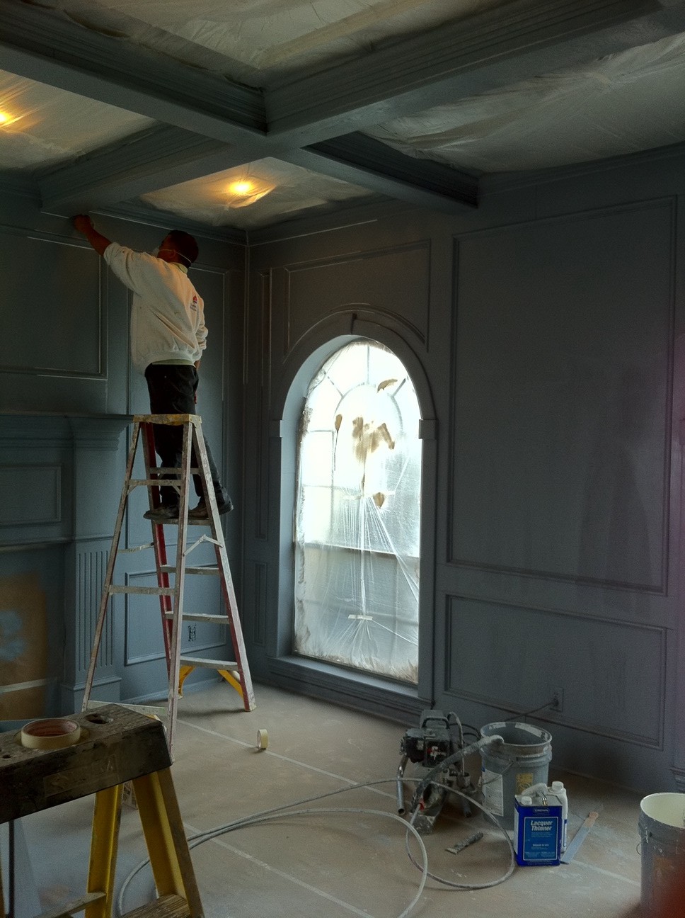
My original plan for this room was to lacquer the walls in a rich black that read midnight blue when the light hit it. I consulted several paint professionals & they all talked me out of using it in this room. Most of them told me that the lacquer would eventually crack on the wood paneling. Big BOO! I have used lacquer a million times on furniture, but never on walls. I was willing to take the risk since it was my own house, but after extensive research on the products available I decided there had to be antoher way to get me the look I was after. SO, onto Plan B. I still wanted the walls to have a VERY high gloss almost wet looking appearance. So, I chose to go with Farrow & Ball’s Off Black in high gloss. We started with 3 coats of primer. I wanted to cover up the grain in the red oak as much as possible.
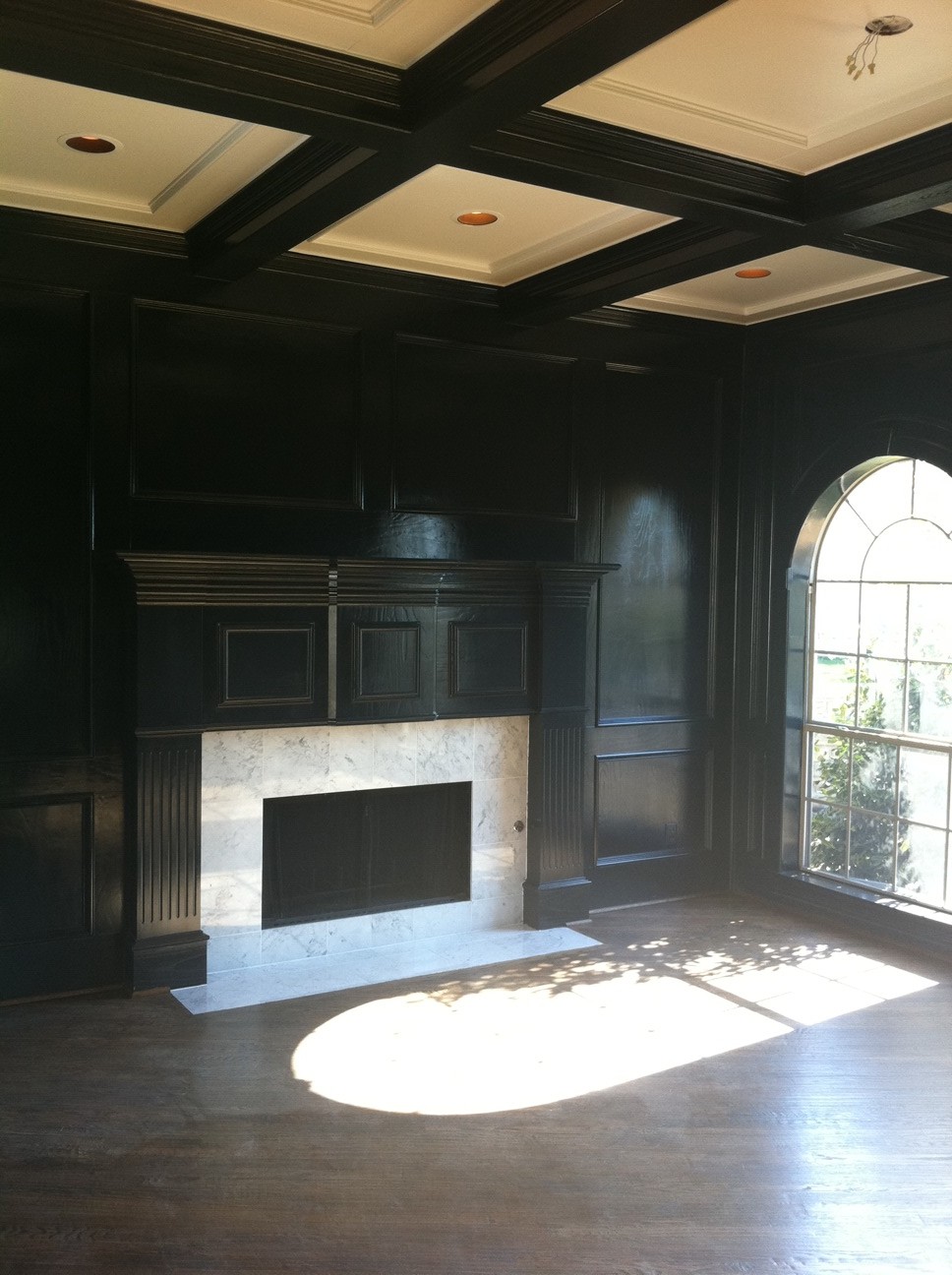
3 coats of primer & 3 coats of Off Black later, I am really starting to dig the new look! I painted the inset of the coffered ceiling Benjamin Moore’s White Herron & the beams are contrasted in the Off Black. This effect really highlights the ceiling detail without making the room dark & cave like. We had all of the floors in the house refinished to a warmer richer brown with more black & less orange red in it. The paneling still needs the final clear coat on it, but the room is really becoming the chic space I had in mind.
My husband often works from home & I just love the layout of this room so I want to pull out all the stops in here! I see this space as a wonderful area to showcase some beautiful design & make it a room we will sit in & enjoy. There is plenty of room for a sitting area. I am still on the hunt for the perfect arrangement for that. I have found a desk that I am dying over (more on that later), but it is clearly not in the budget for this room. I have an alternative selected & I think it will give us the same look & fit in our budget. I plan to use Lee Jofa’s Chevron patterned fabric from Oscar de la Renta’s collection for the drapery fabric. The chevron pattern is on the diagonal & features the midnight blue/rich navy & a slate blue. The white silk background will create a stunning contrast to the Off Black walls. Unfortunately, the fabric is backordered until April. However, good things come to those who wait & I think this is worth waiting for! I can’t wait to see it all come together! Stay tuned for more updates!


