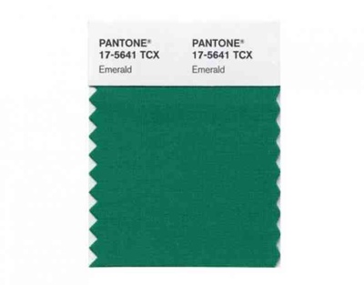
Pantone announced this morning that 2013’s color of the year will be Emerald. “A vivid, verdant green, enhances our sense of well-being further by inspiring insight, as well as promoting balance and harmony.” Sounds great to me!
While I personally tend to be more of a bluesy type of girl (crushing on navy, 2010’s Color of the Year turquoise & everything in between), I’m definitely jumping on board with this jewel tone beauty.

Remember, when I showed you this gorgeous jade cabinet from John Richard that I found at market? I fell so hard for it that I ordered it for my own home. Green definitely made it’s mark at the Fall 2012 High Point Home Furnishings Market.
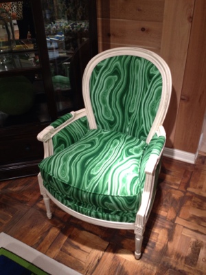 Designers & industry peeps went bananas for this malachite fabric from Robert Allen (seen here at Wesley Hall).
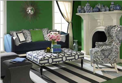
So, how should we implement this beautiful hue into our homes? Is it safe to paint a room this color? I say “Yes!”. Thom Filicia lacquered the walls of the entry of the Kipps Bay Showhouse in a breathtaking emerald green. It was spectacular! Wesley Hall features this stunning display of color on their website.
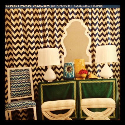
In smaller doses or as an accent: Just a few days ago, I posted Kravet’s new ad for Jonathan Adler on instagram as something that is inspiring me right now. I love how Jonathan made a skirt for this console out of an emerald green fabric. The colors in this vignette are so well balanced.
“It’s also the color of growth, renewal and prosperity – no other color conveys regeneration more than green.” With richly saturated colors like emerald on the scene, I see a very prosperous year ahead!
For more design inspiration find me on instagram (designershay) and on Pinterest & Twitter.
.


