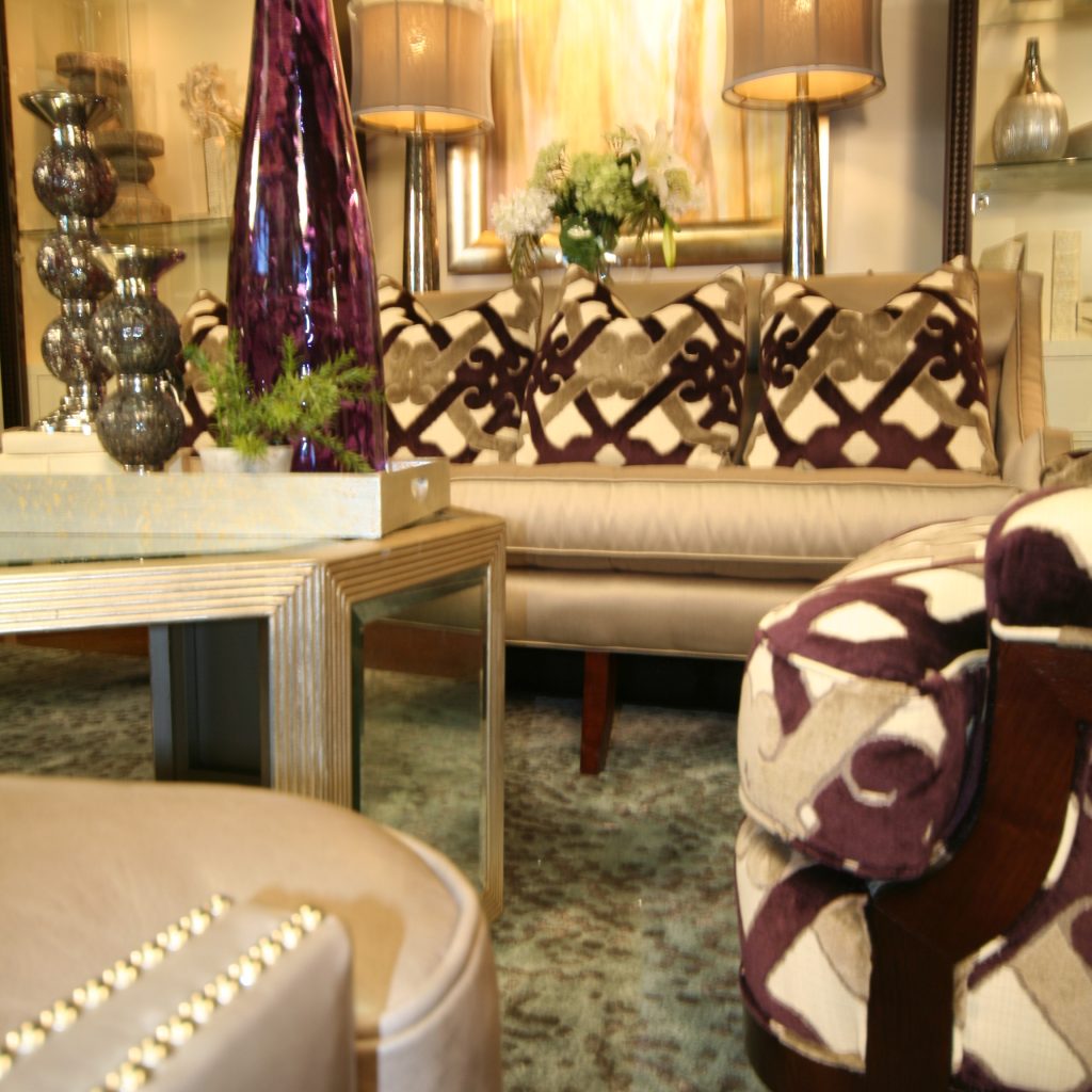
Today on Good Morning Texas I featured a beautiful living room with a silvery gray & luscious purple color palette. Click HERE to watch the segment. The chairs are covered in a rich patterned velvet and add a definitive style to this space. The sofa is very tailored and has a tufted seat cushion. I love that we switched it up a bit by tufting the seat cushion instead of the back of the sofa. We accessorized the room with a purple blown glass vase, geodes &a pair of fabulous silver rain glass lamps from Interlude. The rug we chose adds a soft blue green to the color palette. The playful print on it ties in with the amethyst on the chairs.
Gray is such a yummy neutral. I really have such an affinity for it. With it’s popularity these days, we’re seeing the color used in a variety of design styles. Long gone are the days when the color gray made you think of a cold sterile or industrial space. I was recently at a taping for the Nate Berkus Show & after the taping he graciously answered questions from the audience filled with design bloggers. One of the girls asked him his favorite shades of gray paint. I took a video clip with my iphone while he answered. Check out what he had to say!
Nate Berkus’s Favorite Gray Paints
Well, I must say that Nate has divine taste because my favorite gray paint just happens to be Benjamin Moore’s Dior Gray as well! I have used it in several projects. It seems to be the most perfect shade of gray. It’s rich & warm and just oozing with style. I suppose we should expect nothing less when inspired by the uber-chic Christian Dior! I recently used it in the corporate offices of one of my Dallas clients.
The fabric pictured was one of our accent fabrics. The sofa in the lobby was a warm souffle color. I used Benjmain Moore’s Dior Gray (pictured top), Benjamin Moore’s Pewter (pictured center), and Benjamin Moore’s Acadia White (pictured bottom) throughout the corporate offices. It really turned out brilliantly!


